Use Excel Charting to visualize data in your spreadsheets!
In Excel, table data can be a great way to showcase values in columns and rows. You can sort, filter, and even summarize the data to better understand the information. But when you use charts, you can visualize the data. Charts can be on sheets with information, on sheets by themselves, and even in other Microsoft Office programs like Word and PowerPoint.
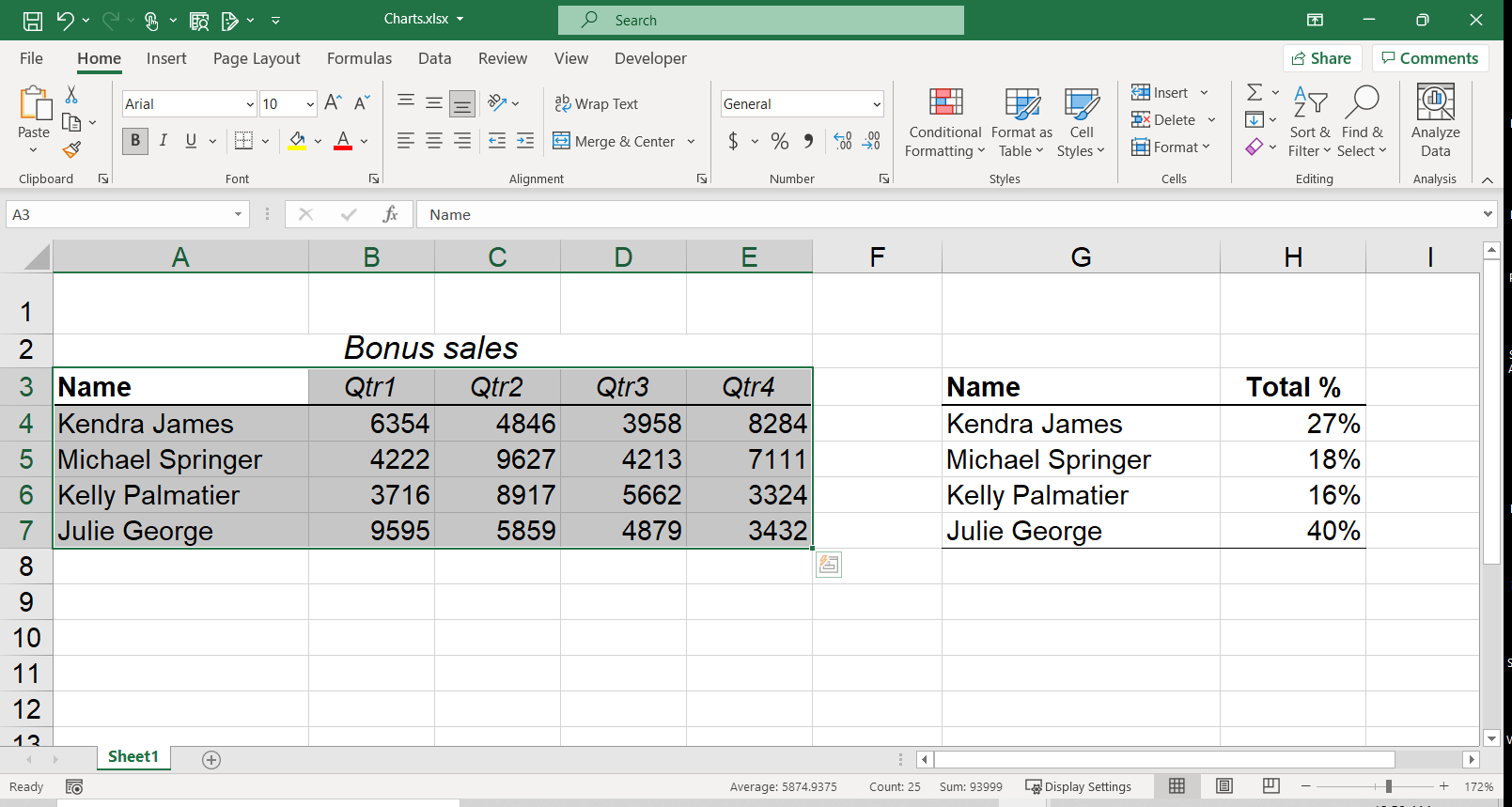
Creating charts is fairly easy. You just need to start with some data in a range:
- Select the data in your worksheet that you want to chart
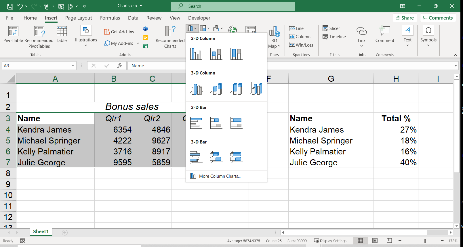
- Go to the Insert Tab and in the Charts Group, select your preferred chart
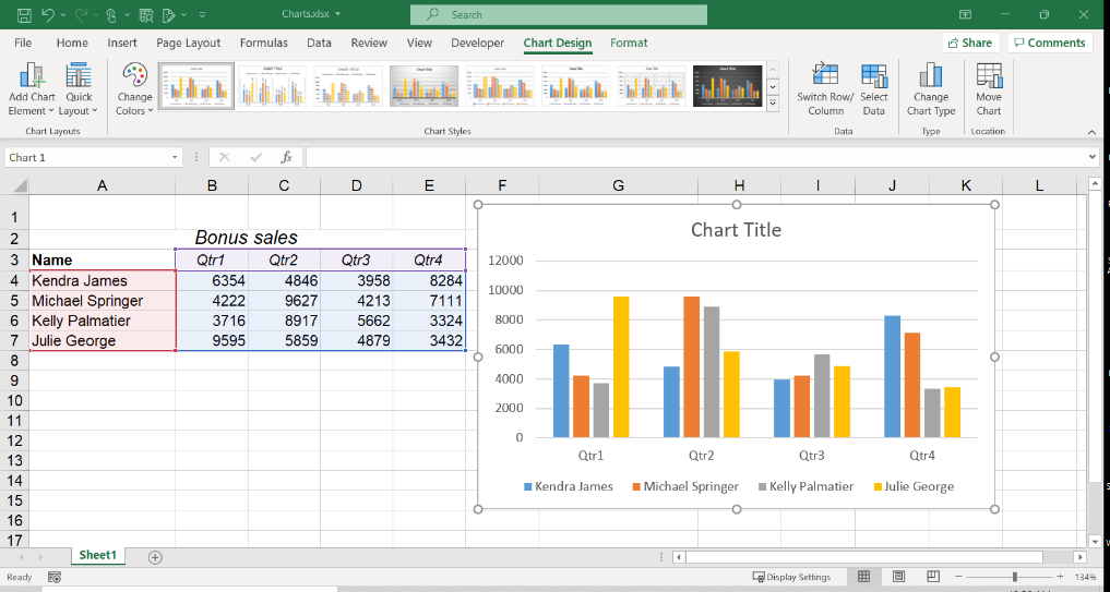
- Move or resize your chart so it is easily accessible to the viewer
Your chart can be copied to other Excel, Word, or PowerPoint documents as needed and well as retaining a connection to the original data by using Paste Special and selecting one of the options with “Link Data”.
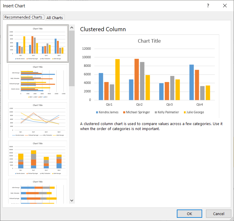
There are many charts types to choose from, and more options with the latest version of Excel. Exploring the various types and choosing the best option can sometimes be difficult, but there is a “Recommended Charts” feature, where Excel filters a smaller list to choose from.
Charts can be a great way to communicate values visually so by using them, you’re not only creating a helpful visual, but you are designing your document to be a bit more colorful!